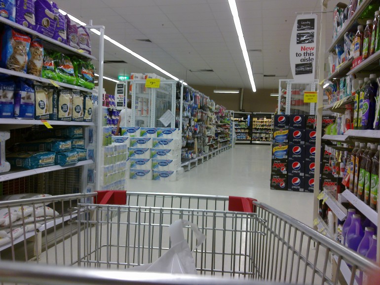
Image Credit: http://en.wikipedia.org/wiki/Aisle
The truth is, there are many tricks of the trade when it comes to retail design. These are put in place to decrease the chance of customers simply entering the store, finding what they want, and leaving without browsing for any other items—known as the “boomerang effect.” Here are just some of the ways retail designers hope to get you to part with your cash.
Engaging the Senses
A study by the American Psychological Association found that different personality types react differently depending on which of their senses are stimulated. For instance, non-impulsive shoppers will purchase slightly less than usual when background music is playing, while impulsive buyers will spend even more freely.
In contrast, when a pleasant scent pervades a store—such as the smell of freshly baked bread from the bakery—non-impulsive shoppers spend more; while impulsive buyers spend less. What is interesting is that all types of shoppers purchase less than usual when in the presence of both music and scent, perhaps due to some kind of sensory overload.
Product Placement
Items that have a high profit margin—otherwise known as speciality goods—are often placed at the direct eye level of browsing shoppers. This is an attempt to get you to buy these over the cheaper alternatives. These are often placed on bottom shelves, which are harder to reach and see. In a similar principle, staple products, like milk and bread, are often placed at the back of the store. This is because even when someone only intends to stock up on an essential, walking through all of the aisles often temps them into making an unintended purchase.
Store Displays
Stores displays, like those found over at www.printdisplays.com, are often used for seasonal items or products that are currently on sale. These are items that may have a limited life-span so it’s in their interest to sell them quickly. You’ll usually find these right at the end of the aisle so that the customer’s view is never taken away from the display as they walk down the aisle.
Another interesting way a store organises displays is to intentionally make them look messy. “The jumble sale” effect is most commonly found in clothes stores where shoppers are encouraged to look through items more carefully. Joann Peck, a marketing professor at the University of Wisconsin, created a need-for-touch scale, which found that the more time an item is spent in a person’s hand, the more likely they were to purchase it.
It’s fascinating to think of all the details that go into to setting up a store. The food industry alone is worth 96.1bn to the UK economy so it’s not surprising that they have experts looking for every advantage they can find. The next time you’re out on your weekly shop, see how many of these techniques you can spot yourself.
Did you enjoy this sector spotlight? It is a different style of post from us. If you would like us to create a successful Content Marketing Plan for you or have questions relating to Content Marketing give us a call on +44 (0) 845 2264 247 or email us via mail@marketingfundamentals.com. Marketing Fundamentals Ltd are a leading Content Marketing Agency in London. We create Content that builds relationships with your potential customers and generates leads and sales.
We hope you have found this information useful. Thanks for reading!
Best regards,
Marketing Fundamentals Team
Subscribe to our
Follow us on LinkedIn
This is blog post number 258. This is a sponsored post.
Follow us on Social Media


